
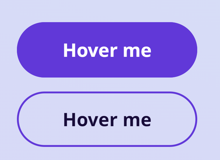
Wavy Hover Buttons

Step 1
<!DOCTYPE html>
<html lang="en" >
<head>
<meta charset="UTF-8">
<title>CodePen - Wavy</title>
<link rel="stylesheet" href="https://cdnjs.cloudflare.com/ajax/libs/meyer-reset/2.0/reset.min.css">
<link rel="stylesheet" href="./style.css">
<script src="https://cdnjs.cloudflare.com/ajax/libs/prefixfree/1.0.7/prefixfree.min.js"></script>
</head>
<body>
<!-- partial:index.partial.html -->
<a class="btn" href="#0">Hover me</a><a class="btn outlined" href="#0">Hover me</a>
<!-- partial -->
</body>
</html>
Step 2
@import url("https://fonts.googleapis.com/css2?family=Noto+Sans:wght@700&display=swap");
.bg-video {
content: "";
position: absolute;
width: 100%;
height: auto;
min-height: 100%;
display: flex;
align-items: center;
justify-content: center;
}
.bg-video:before {
content: "";
width: 100%;
padding-bottom: 56.25%;
display: block;
height: 0;
}
.bg-video iframe {
position: absolute;
top: 50%;
left: 50%;
width: 1000%;
height: 135%;
transform: translate3d(-50%, -50%, 0);
}
body {
display: flex;
align-items: center;
justify-content: center;
flex-direction: column;
gap: 1.5em;
overflow: hidden;
width: 100vw;
height: 100vh;
font-size: max(3.333vmin, 16px);
font-family: "Noto Sans", sans-serif;
-webkit-font-smoothing: antialiased;
-moz-osx-font-smoothing: grayscale;
}
body:before {
content: "";
position: absolute;
inset: 0;
background: linear-gradient(20deg, #3844d8 40%, #385fd8);
opacity: 0.2;
}
.btn {
overflow: hidden;
position: relative;
z-index: 0;
text-decoration: none;
color: white;
display: inline-flex;
align-items: center;
justify-content: center;
flex-wrap: wrap;
font-size: 2em;
min-width: 13ch;
padding: 1em 1.15em;
border-radius: 2em;
transition: opacity 0.3s cubic-bezier(0.2, 0, 0.1, 1), transform 0.3s cubic-bezier(0.2, 0, 0.1, 1), box-shadow 0.5s ease, color 0.5s ease, background 0.5s ease;
will-change: box-shadow, color, transform, opacity, background;
background: #6138D8;
box-shadow: inset 0 0 0 0.1em #6138D8, 0 0 0 rgba(124, 56, 216, 0);
}
.btn.outlined {
display: inline-flex;
background: none;
color: #170b39;
}
.btn:after, .btn:before {
content: "";
position: absolute;
z-index: -1;
pointer-events: none;
top: 0;
right: -50%;
left: -50%;
height: 0;
padding-bottom: 200%;
border-radius: 39%;
border: unset;
transition: transform 0s cubic-bezier(0.2, 0, 0.1, 1) 0.5s, opacity 0.5s cubic-bezier(0.2, 0, 0.1, 1);
opacity: 0;
}
.btn:before {
transform: translate3d(-10%, 4.8em, 0) rotate(330deg);
background: linear-gradient(25deg, #9638d8, rgba(150, 56, 216, 0));
}
.btn:after {
transform: translate3d(10%, 4.8em, 0) rotate(0deg);
background: linear-gradient(70deg, rgba(150, 56, 216, 0.5), rgba(124, 56, 216, 0));
}
.btn:hover, .btn:focus {
transition: opacity 0.3s cubic-bezier(0.2, 0, 0.1, 1), transform 0.3s cubic-bezier(0.2, 0, 0.1, 1), box-shadow 2s ease, color 1.5s ease, background 1s ease 0.75s;
background: #9638d8;
box-shadow: inset 0 0 0 0.1em #6138D8, 0 0 1.75em rgba(150, 56, 216, 0.5);
}
.btn:hover.outlined, .btn:focus.outlined {
color: white;
}
.btn:hover:before, .btn:hover:after, .btn:focus:before, .btn:focus:after {
transition: transform 2s ease 0s, opacity 0.2s ease;
opacity: 1;
}
.btn:hover:before, .btn:focus:before {
transform: translate3d(-10%, -1em, 0) rotate(100deg);
}
.btn:hover:after, .btn:focus:after {
transform: translate3d(10%, -1em, 0) rotate(180deg);
}